CASE STUDY 
Bringing A Global Mission Online
A brand-first website design for a non-profit finding its digital voice, built to make their mission easy to understand and easy to support.
Pain Points
- Established Color
- Established Brand
- Age Demographic
- Budget Constraints
Solutions
- Integrated Themes
- Streamlined User Experience
- Maximized Limited Resources
Services
- Research
- Wireframing
- UI Design
- Development
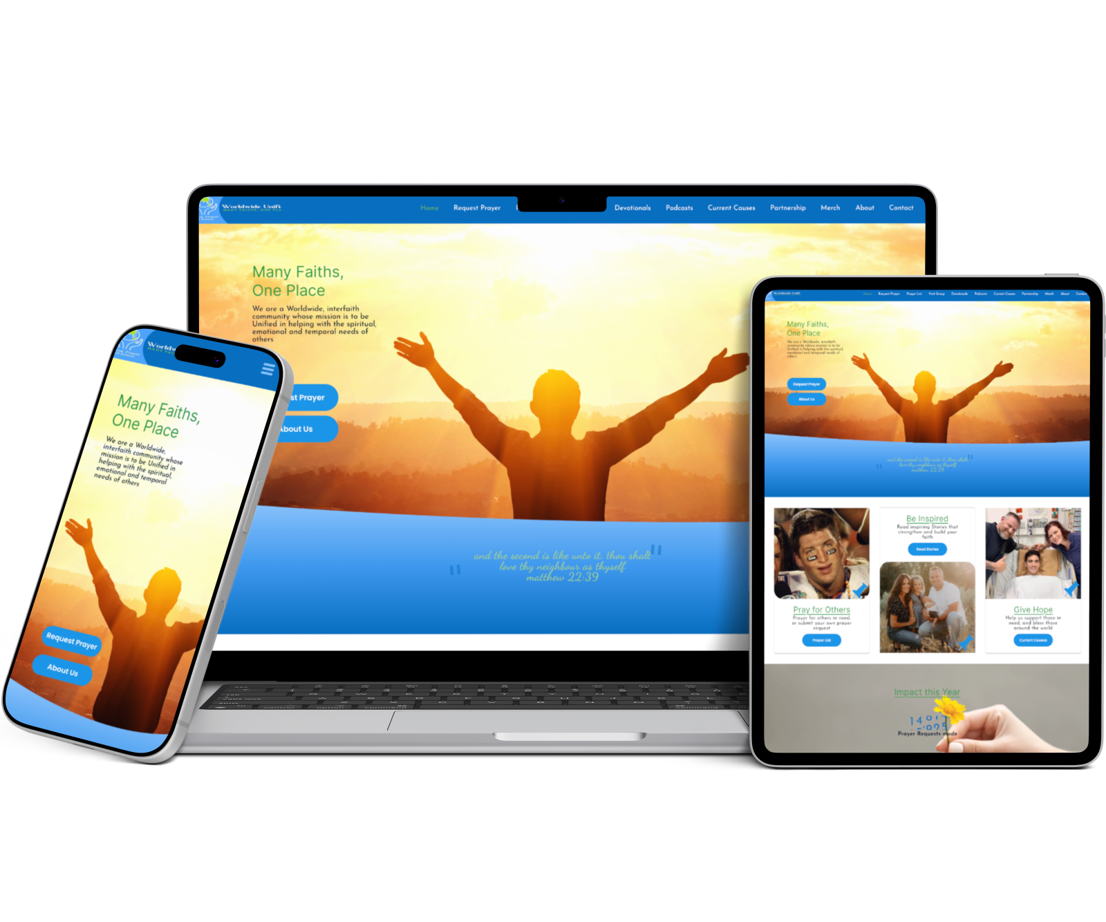

THE CLIENT
World Wide Unified
World Wide Unified is an interfaith, global organization dedicated to fostering love and connection between people of all backgrounds and beliefs. Their mission is to create a world where everyone feels valued and connected.
Launch Plan
Orbit
Project Type
New Website
Industry
Non-Profit
The Goal
Keep the familiar parts of the brand, especially the colors and typography from their logo, while giving the website a fresh, modern feel. We wanted it to feel more engaging without losing the brand’s identity, while making it easier for visitors to find what they need, understand World Wide Unified’s vision, and navigate the site comfortably.
The Approach
Through user research, we found that most of the nonprofit’s audience was older adults. Because of that, we wanted to make the site as easy and accessible to use as possible while still keeping the brand’s existing look and feel. We paid close attention to the navigation, typography, and layout, especially on mobile, to make sure the site felt simple and easy to get around
The Result
The final design gave World Wide Unified a fresh, approachable website while staying true to the brand they had already built. We focused on clear navigation, accessible typography, and a simple mobile experience that would be easy for their audience to use. While the site ultimately wasn’t launched due to changes in the organization’s funding, the project allowed us to create a complete digital experience built around their goals and audience.
DESIGN DETAILS
A closer look
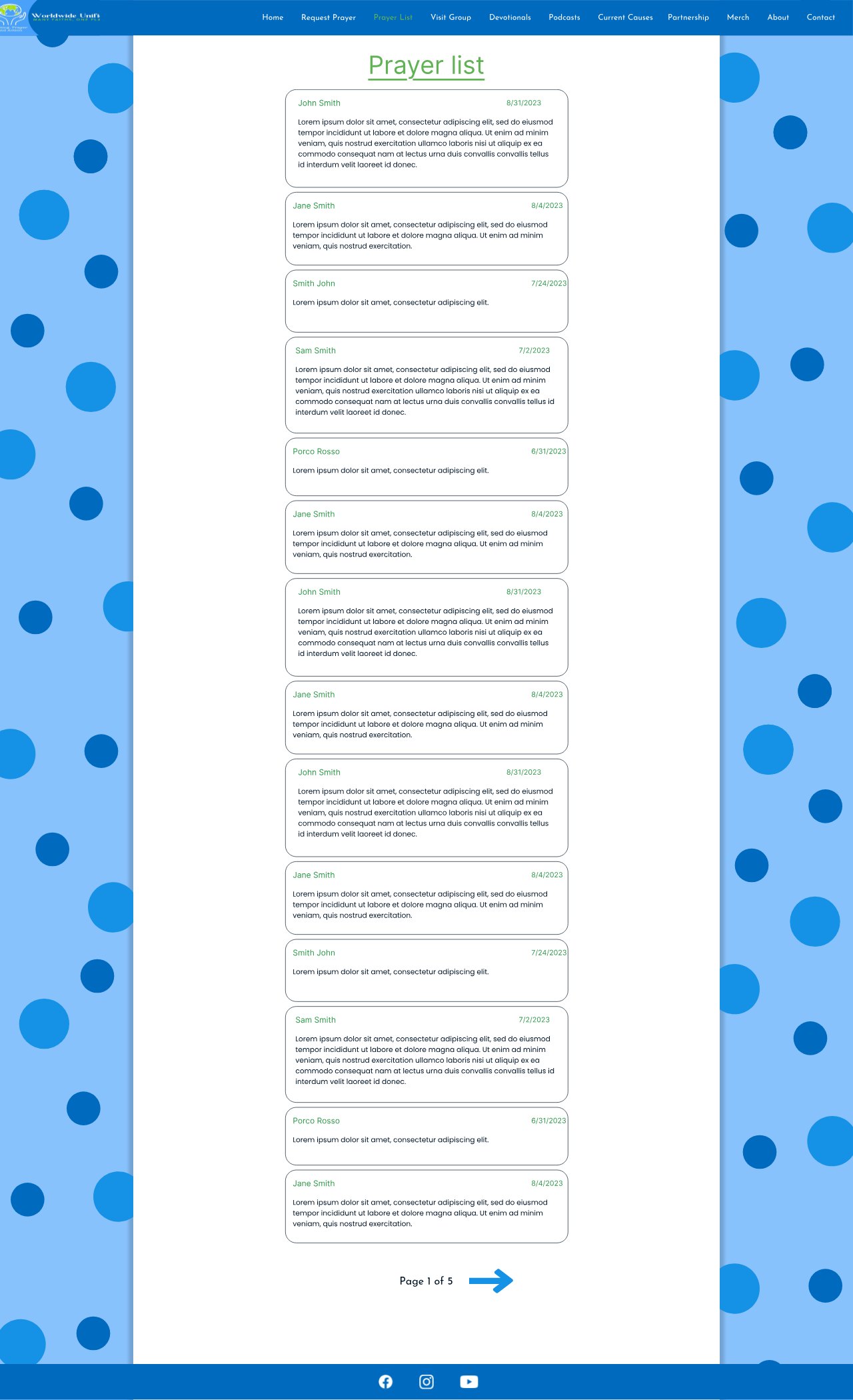
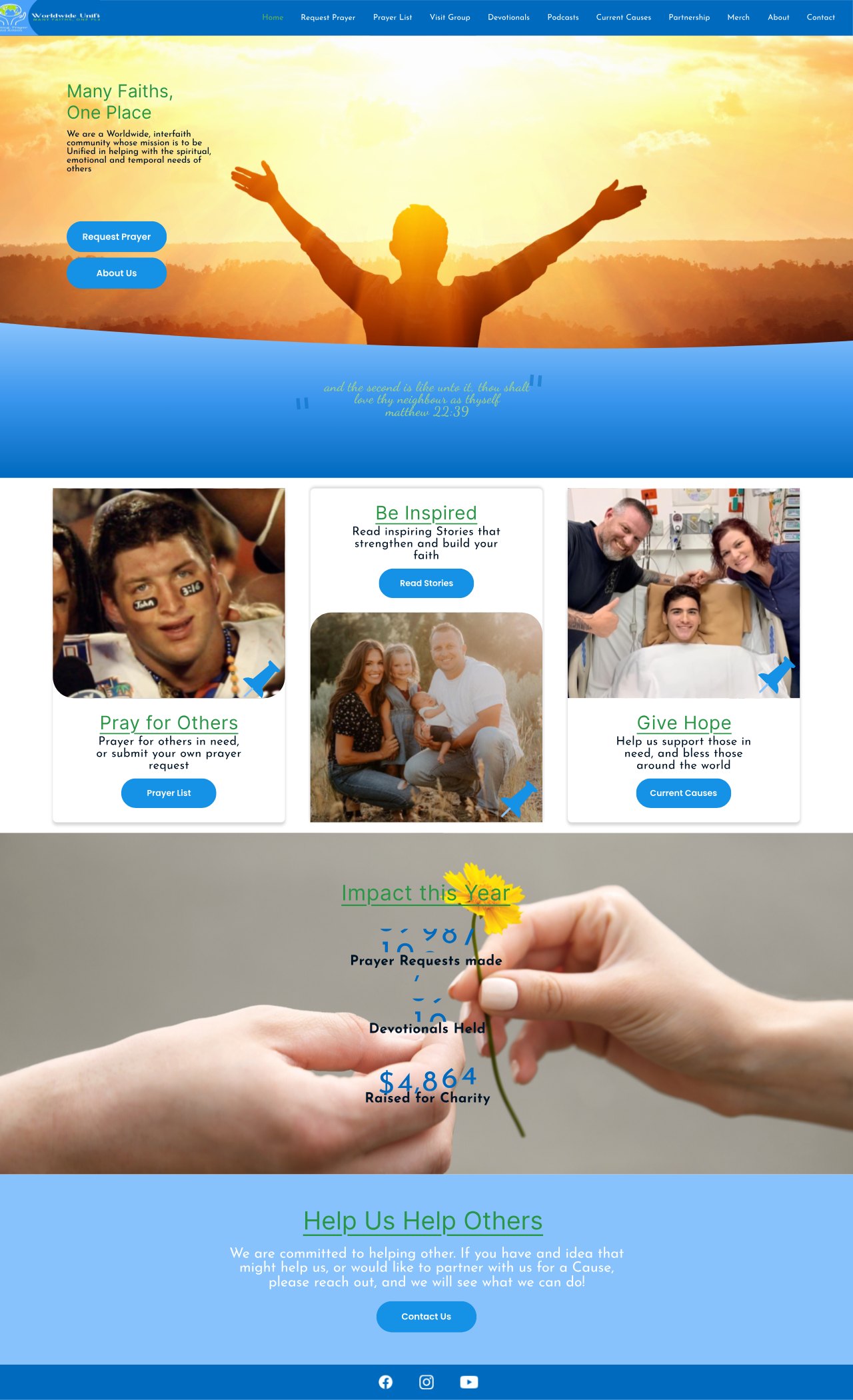
Check out a couple of the pages made for this website. Hover over the dots below to see the thinking behind the layout choices and the things that make these pages unique.
Medium-Dark Blue
Sky Blue
Sea Green
Typography
Inter and Josefin Sans are the two typefaces used throughout the site: Inter keeps body copy clean and easy to read, while Josefin Sans adds a bit of character to headings and titles.
Inter
Lorem ipsum dolor sit amet, consectetur adipiscing elit, sed do eiusmod tempor incididunt ut labore et dolore magna aliqua. Ut enim ad minim veniam, quis nostrud exercitation ullamco laboris nisi ut aliquip ex ea commodo consequat. Duis aute irure dolor in reprehenderit in voluptate velit esse cillum dolore eu fugiat nulla pariatur.
Josefin Sans
Lorem ipsum dolor sit amet, consectetur adipiscing elit, sed do eiusmod tempor incididunt ut labore et dolore magna aliqua. Ut enim ad minim veniam, quis nostrud exercitation ullamco laboris nisi ut aliquip ex ea commodo consequat. Duis aute irure dolor in reprehenderit in voluptate velit esse cillum dolore eu fugiat nulla pariatur.